VR UX Case Study: Tilt Brush
My day job consists of creating virtual and augmented reality applications for teaching and learning at my local University. In doing this, we run into far more inexperienced users than traditional VR games do. Most of the people using our tools and applications have never experienced virtual reality first hand. Ultimately, this means that a significant amount of our target audience has based their entire digital experience expectations on the interactions they’ve grown accustomed to on their phones, tablets, and workstations—namely 2D interactions on a 2D screen with 2D objects. Overcoming the tendency to think of and interact with digital spaces as two-dimensional rather than three-dimensional is VR’s great power, however it comes with a cost—upending 30 years of 2D zeitgeist is no easy task.
As many have observed (including myself), new VR users are often hesitant to actually move about in a 3D space—when given a headset and controllers, most people stand perfectly still with their hands hovering in front of them until someone or something nudges them along. This is problematic for us, as we can’t always guarantee that someone will be there to nudge them along. As such, it’s critically important for us to carefully design the user experience so that players can engage with the tool with absolutely no outside help. Although this is a common problem in VR, it is all the more complicated by the lack of experience and confidence of our users.
In our work, we need to bridge the gap between the 2D interactions and experiences that users expect and the 3D interactions that virtual reality demands. So far I have seen no app do this better than Tilt Brush. In an effort to replicate that success, I decided to take a closer look at how Tilt Brush handles UX in VR, and what I’ve found is briefly presented here.
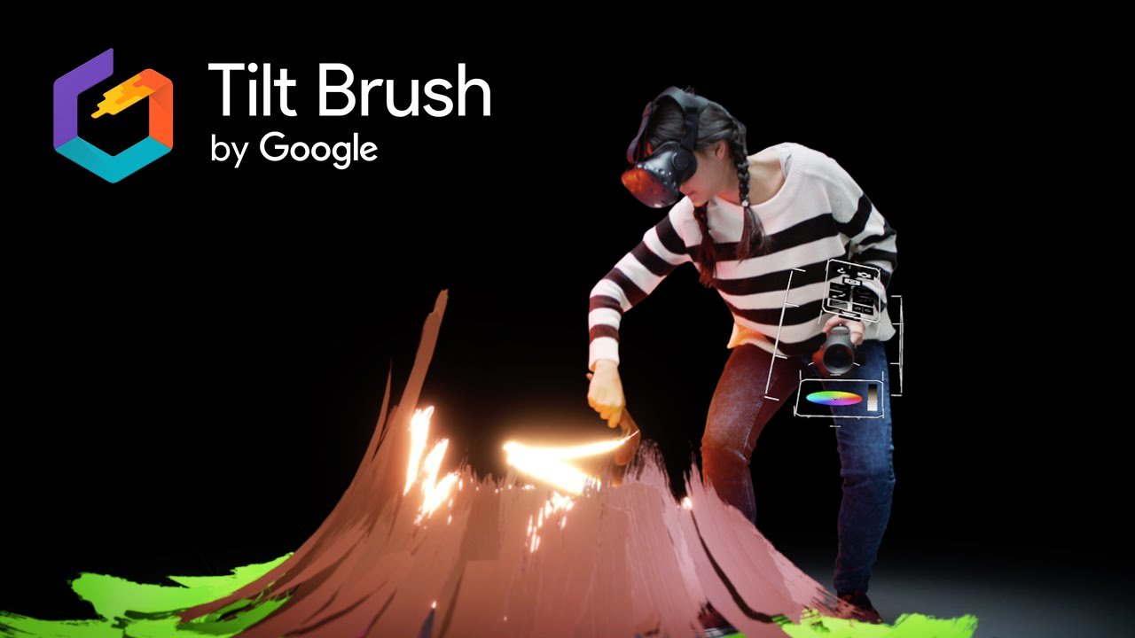
When you launch Tilt Brush, you are immediately made to watch the Tilt Brush intro being painted in 3D, seldom exactly where you are looking. Combining this with spatial audio and an otherwise empty scene, the app engages the user to look around and see what’s going on. Once the intro is over, a soft “sketching” sound comes from your controllers. When the user naturally takes a look, they see a prompt to hold the trigger to paint. It’s important to note that at this point, nothing else is active or enabled on the controllers, both allowing and forcing the user to focus on the task at hand: learning how to paint in VR.
Once the user has painted their first brush stroke, a 3-dimensional menu springs to life on the left hand (accompanied by an attention-grabbing “swooshing” sound). The menu itself is reminiscent of a painter’s palette, however extended into three dimensions. This menu, and the user’s interactions with it, are the focus of my attention here as it is where the bulk of the 2D—3D transition resides.
Initially, the user is not going to know exactly how to interact with this menu. After giving it a good look-over (assuming the giddiness of drawing in 3D is overcome), users will eventually try to either touch the menu with their right hand, or at the very least point to it in some way. As soon as the user does point to the menu (and their hands are close enough together), the entire menu pane they’re looking at springs to life:
- The whole pane moves forward normal to its surface by about a centimetre or two
- The borders and icons of the pane go from dull grey to a much brighter grey
- A text label placed beside the menu springs forward to tell you what you’re looking at
- A dotted line projects from your right controller to the menu pane, indicating that you can point at things on the menu
I believe this dotted line springing from your controller onto the menu pane is vitally important. It visually signals the user that they are interacting in a different way that the painting they just accomplished—this is the first time they’ll see an animated dashed line coming from their controller in the app. The dashed line also signals that the user doesn’t have to actually touch their right controller to the menu to interact with things. Finally, it tells the player exactly what they’re pointing at, helping them select buttons with intent.
Now that the user has figured out that they can point at the menu, they will naturally gravitate to pointing at one of the many icons they see. Naturally, as the user points at a specific icon, that icon springs to life. This becomes the same as hovering over it with a mouse cursor, and some somewhat similar (if more emellished) techniques used in 2D interfaces are employed. Namely, the icon:
- Changes its z-depth, springing forward to indicate you’re pointing at it
- Changes from a dull grey to a bright white
- A text tooltip pops up beside the button describing what it does
- The icon animates (in 3D) by gently rotating back and forth
With these visual additions, it quickly becomes clear to the user that what they’ve just pointed at is again, something new and unique.
Tilt Brush tries to keep contextual information available to the user. Not only is there a constant trace of the brush you’re “holding” emanating from the tip of your controller, but parts of the controller are continually lit up in the same colour that your brush is, giving you confidence that what you’re about to draw is what you actually want to draw.
Another trick Tilt Brush has up its sleeve is the visual shape of the controller model itself. Althugh this model is based off the standard Vive controller, complete with: application button; system button; thumb pad; grips; and trigger, the model doesn’t include the big heavy tracking circle on the end of the physical controller. At first I didn’t think that mattered all that much, until I started running my own experiments. As it turns out, that large circle is inherently confusing to people trying to use the controller to do precise work. In our own apps, we use a “fine point” to allow users to select things, and compared user interactions between a controller model with the circle and without the circle. When using the point to try to interact with objects, almost every user shown a controller without the circle immediately figured out how to use the point, whereas people using the contoller with the circle were largely confused and had to be explicitely instructed.
To summarize, Tilt Brush does some specific things to help facilitate the user experience (especially for people used to 2D interfactes):
- Use audio cues and both positive and negative visual cues to draw the user’s attention to something.
- Combine 2D and 3D in an intuitive way. We’re used to purely 2D interfaces, so Tilt Brush creates 2D interfaces and lays them out in 3D, and allows interface items to operate in the third dimension.
- Use a dashed line emanating from the controller to indicate that something is being pointed at.
- Animate and brighten interface items as they are being interacted with (important in all interfaces, really).
- Provide many context clues where possible (text, colour, sound, etc).
- Provide visual controller design that facilitates being used the way the developers intended while remaining mostly true to the physical manifestation of the controller.