Better Beamer Themes
I love LaTeX for typesetting all my documents. A lot of people don’t understand why, but that’s a discussion for another time. One thing I’ve always been hesitant to use LaTeX for is presentations - the main LaTeX package for making presentations is Beamer, and although it is extremely functional, I am firmly of the opinion that all the default themes are butt ugly and there are barely any other themes out there. Thankfully, Beamer themes are very easy to create from scratch!
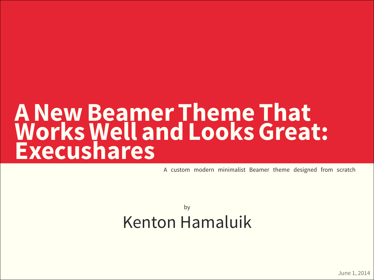
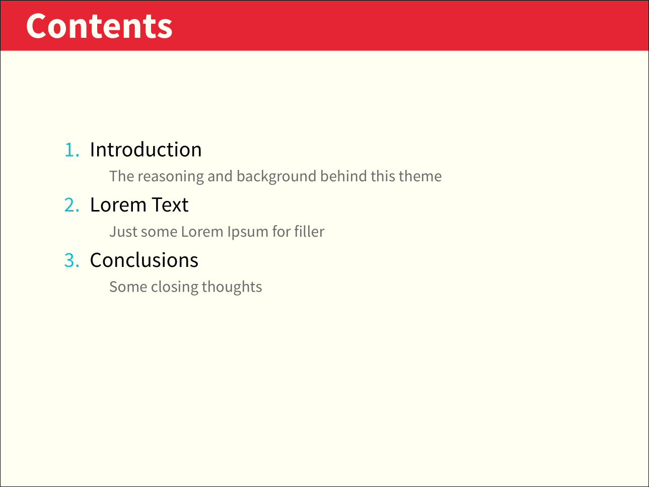
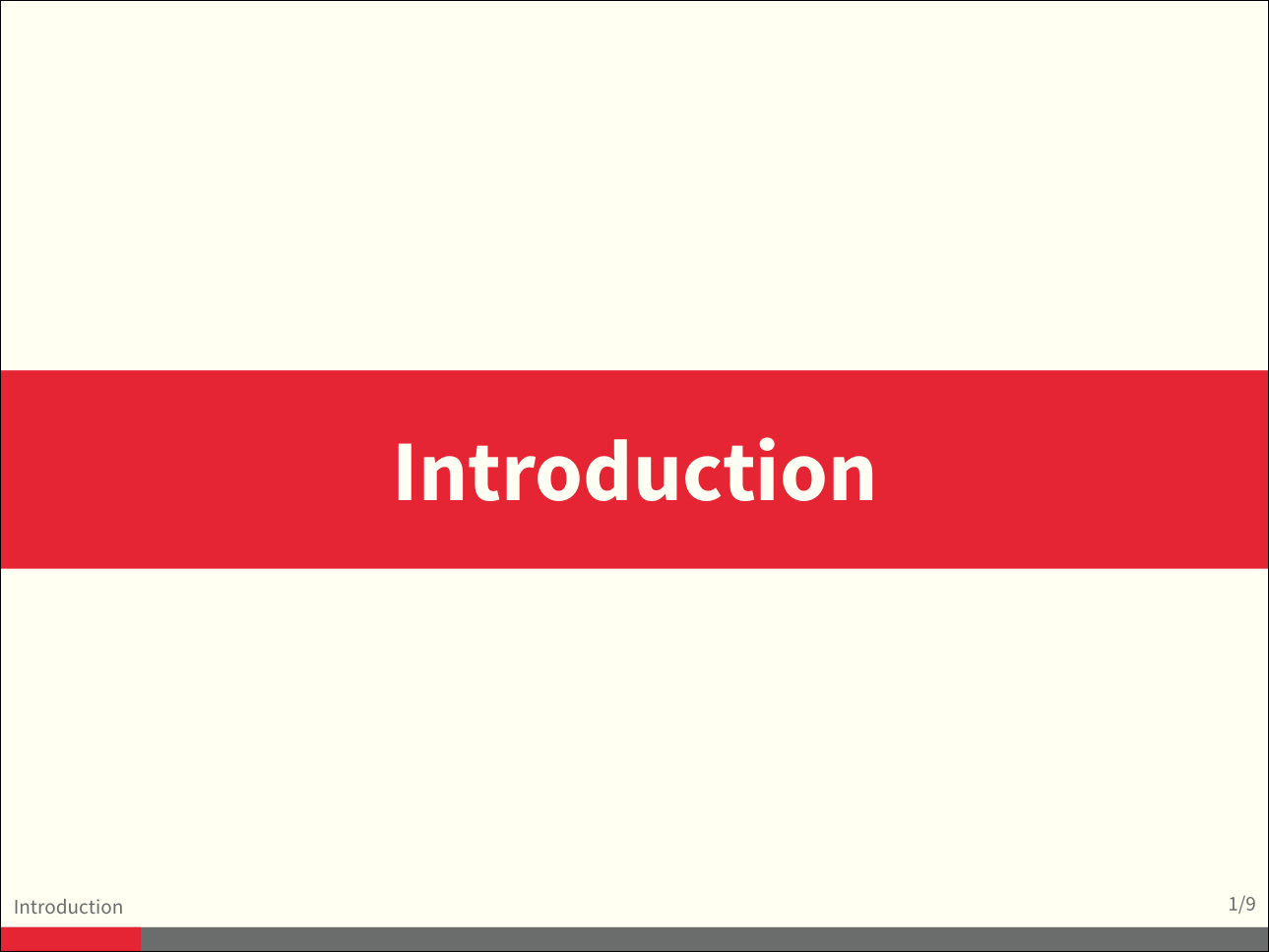
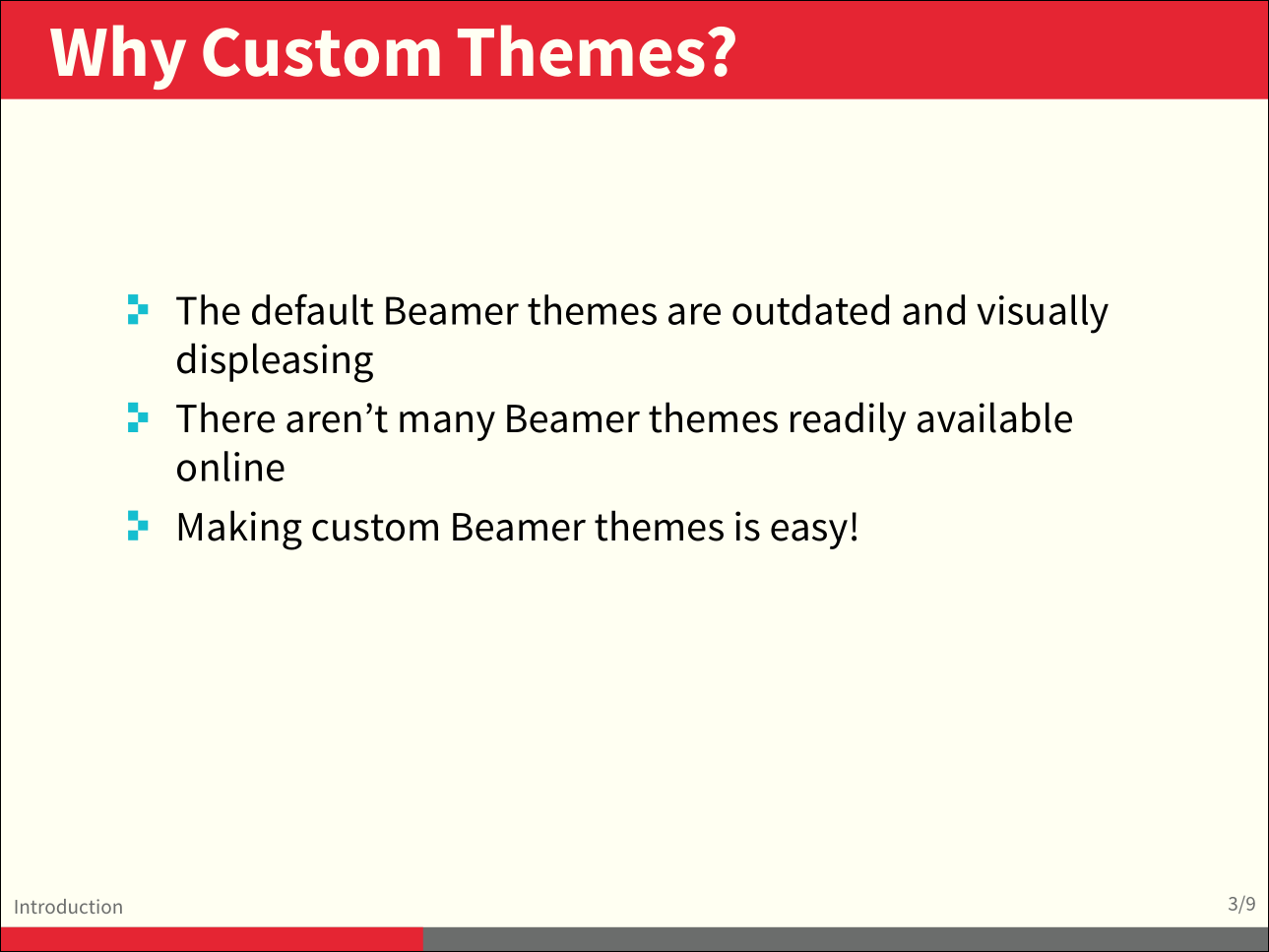
For my thesis defence, I wanted to use LaTeX to beautifully typeset the technical content of my work. I also want my presentation to look good, and none of the default beamer themes nor any others I could find online did that for me. I really love the colour theme that I’m using now on this site (found on Adobe Kuler: “Some Kind Of Execushares” by pickton), so I decided to make a simple and “modern” theme using those colours. I think I did OK, as you can see by some sample shots:
If you just want to grab the theme now without taking a look into how it was made, you can check it out on Github. Otherwise, let’s dig in!
First things first, realize that Beamer “themes” are pretty much just .sty files, so we can go ahead and create a new .sty file. Since we want the theme to be called “Execushares”, the file must be named beamerthemeExecushares.sty, and we should put it in the same file as the main .tex document. We also want to use custom fonts, so for that I’m going to use XeLaTeX. We can start off our sample file like so:
%!TEX program = xelatex
\documentclass{beamer}

\usetheme{Execushares}

\title{A New Beamer Theme That Works Well and Looks Great: Execushares}
\subtitle{A custom modern minimalist Beamer theme designed from scratch}
\author{Kenton Hamaluik}
\date{June 1, 2014}

\setcounter{showSlideNumbers}{1}

\begin{document}

    \frame{\titlepage}

\end{document}
This will create a simple presentation with a single title slide using our custom theme (which we haven’t created yet). If we whip over to our empty beamerthemeExecushares.sty file, we can start setting up libraries and colours:
% the various libraries we will be using
\usepackage{tikz}
\usetikzlibrary{calc}
\usepackage[none]{hyphenat}
\usepackage{fontspec}
\defaultfontfeatures{Ligatures=TeX}

% define colours
% taken from pickton on Adobe Kuler:
% https://kuler.adobe.com/Some-Kind-Of-Execushares-color-theme-3837185/
\definecolor{ExecusharesRed}{RGB}{230,37,52}
\definecolor{ExecusharesBlack}{RGB}{43,40,40}
\definecolor{ExecusharesBlue}{RGB}{22,190,207}
\definecolor{ExecusharesWhite}{RGB}{255,255,243}
\definecolor{ExecusharesGrey}{RGB}{107,110,108}
We need the tikz library for all our fancy slide drawing, hyphenat to disable word hyphenating in the titles, and fontspec to use TTF fonts. Defining the colours here is useful and pretty standard. To enable the use of the lovely Source Pro fonts from Adobe, we can add the following (which is rather self-explanatory).
% use Adobe's Source Pro fonts:
% Source Serif Pro: http://store1.adobe.com/cfusion/store/html/index.cfm?store=OLS-US&event=displayFontPackage&code=1966
% Source Sans Pro: http://store1.adobe.com/cfusion/store/html/index.cfm?event=displayFontPackage&code=1959
% Source Code Pro: http://store1.adobe.com/cfusion/store/html/index.cfm?store=OLS-US&event=displayFontPackage&code=1960
\setmainfont{Source Serif Pro}
\setsansfont{Source Sans Pro}
\setmonofont{Source Code Pro}
Remember those colours we just defined? We can start using them here, where we tell Beamer what to make lists look like (as well as \alerted text):
% set colours
\setbeamercolor{itemize item}{fg=ExecusharesBlue}
\setbeamercolor{enumerate item}{fg=ExecusharesBlue}
\setbeamercolor{alerted text}{fg=ExecusharesBlue}
\setbeamercolor{section in toc}{fg=ExecusharesBlack}
Slides should not have too much text on them and any text should be easy to read. One of the easiest ways to do this is make all the text rather large, which is what we’re doing here:
% set fonts
\setbeamerfont{itemize/enumerate body}{size=\large}
\setbeamerfont{itemize/enumerate subbody}{size=\normalsize}
\setbeamerfont{itemize/enumerate subsubbody}{size=\small}
Now to make the fancy pixelated-looking itemize bullet points (the > shapes), we can use tikz:
% make the itemize bullets pixelated >
\setbeamertemplate{itemize item}{
    \tikz{
        \draw[fill=ExecusharesBlue,draw=none] (0, 0) rectangle(0.1, 0.1);
        \draw[fill=ExecusharesBlue,draw=none] (0.1, 0.1) rectangle(0.2, 0.2);
        \draw[fill=ExecusharesBlue,draw=none] (0, 0.2) rectangle(0.1, 0.3);
    }
}
If you don’t know tikz, it can be very daunting. However it is certainly worth learning as it usually ends up being the most powerful and easy-to-use solution to get great graphics. I learned tikz by heavily utilizing Stack Exchange, but if you can find any easy-to-digest tutorials out there I would love to hear about them! Basically all I’m doing here with tikz is drawing 3 squares in the desired pattern, filling them with the theme’s blue colour and making sure they have no outline (draw=none). We can do the same thing for subitems, just making them a bit smaller and red:
% make the subitems also pixelated >, but a little smaller and red
\setbeamertemplate{itemize subitem}{
    \tikz{
        \draw[fill=ExecusharesRed,draw=none] (0, 0) rectangle(0.075, 0.075);
        \draw[fill=ExecusharesRed,draw=none] (0.075, 0.075) rectangle(0.15, 0.15);
        \draw[fill=ExecusharesRed,draw=none] (0, 0.15) rectangle(0.075, 0.225);
    }
}
Although I think the typical Beamer navigation buttons that includes are a neat idea, I never use them and almost always disable them because they can be such a distraction. To disable them completely, we can add the following to our style file:
% disable navigation
\setbeamertemplate{navigation symbols}{}
I’m also not a fan of the “Figure:” that precedes caption text (in a presentation), so we can easily strip that as well:
% disable "Figure:" in the captions
\setbeamertemplate{caption}{\tiny\insertcaption}
\setbeamertemplate{caption label separator}{}
That’s about it for Beamer-specific configuration! The rest is pretty much using tikz to draw the shapes and themes of our slides. Since I do this all manually (which is probably bad form but works well and is easy, so I don’t really care), we can prevent Beamer from doing its own thing with the title page and slide titles:
% we're drawing the title page ourselves, so blank out Beamer's implementation
\setbeamertemplate{title page}{}

% same thing with the frame titles
\setbeamertemplate{frametitle}{}
One last thing before I go on to the fun drawing bits: in order to customize the slides a bit, I use counters to enable / disable certain visual aspects. For example, I have included the option with this theme to have a progress bar on the bottom which indicates how far into the presentation you are. When it comes to the additional backup slides in your presentation however, the progress bar is superfluous and confusing. So for those slides, if you change the progress bar counter to 0, the progress bar will be turned off. This is rather hacky, so if anyone knows a better and easier way of setting up “toggles” like this in LaTeX, please let me know! This is how I define those “variables”:
% since I don't know a better way to do this, these are all switches
% doing `\setcounter{showProgressBar}{0}` will turn the progress bar off (I turn it off for Appendix slides)
% etc
\newcounter{showProgressBar}
\setcounter{showProgressBar}{1}
\newcounter{showSlideNumbers}
\setcounter{showSlideNumbers}{1}
\newcounter{showSlideTotal}
\setcounter{showSlideTotal}{1}
In any presentation it’s essential that you include slide numbers, and I think it’s a damned good idea to give your audience an indicator of how far along in the presentation you are, hence the progress bar. To achieve this I adapted a Stack Exchange answer:
% use \makeatletter for our progress bar definitions
% progress bar idea from http://tex.stackexchange.com/a/59749/44221
% slightly adapted for visual purposes here
\makeatletter
\newcount\progressbar@tmpcounta% auxiliary counter
\newcount\progressbar@tmpcountb% auxiliary counter
\newdimen\progressbar@pbwidth %progressbar width
\newdimen\progressbar@tmpdim % auxiliary dimension

% make the progress bar go across the screen
\progressbar@pbwidth=12.8cm
Basically, this defines some variables which relate to the current slide number and the total number of slides. We will use these to calculate the width of the progress bar being the appropriate percentage of each slide that it’s on. Now we can start to define the “background” (design) of our slides:
% use tikz to draw everything
% it may not be the best, but it's easy to work with
% and looks good
% TODO: base title slide and contents slide on something other than slide numbers :/
\setbeamertemplate{background}{
    % deal with progress bar stuff
    % (calculate where it should go)
    \progressbar@tmpcounta=\insertframenumber
    \progressbar@tmpcountb=\inserttotalframenumber
    \progressbar@tmpdim=\progressbar@pbwidth
    \multiply\progressbar@tmpdim by \progressbar@tmpcounta
    \divide\progressbar@tmpdim by \progressbar@tmpcountb

    \begin{tikzpicture}
        % set up the entire slide as the canvas
        \useasboundingbox (0,0) rectangle(\the\paperwidth,\the\paperheight);

        % the background
        \fill[color=ExecusharesWhite] (0,0) rectangle(12.8cm,9.6cm);
This is where we actually calculate width of the progress bar (making use of the calc tikz library). We then start a tikz environment and define the entire area of the slide as our bounding box. I also draw a big rectangle across the entire slide, making it my desired background colour.
Next up we can draw the title page:
        % separate the drawing based on if we're the first (title) slide or not
        \ifnum\thepage=1\relax
            % the title page
            % draw the fills
            \fill[color=ExecusharesRed] (0, 4cm) rectangle(12.8cm, 9.6cm);

            % draw the actual text
            \node[anchor=south,text width=11.8cm,inner xsep=0.5cm] at (6.4cm,4cm) {\color{ExecusharesWhite}\Huge\textbf{\inserttitle}};
            \node[anchor=north east,text width=11.8cm,align=right] at (12.3cm,4cm) {\color{ExecusharesBlack}\tiny\insertsubtitle};
            \node[above] at(6.4cm,2.25cm) {\color{ExecusharesBlack}\tiny by};
            \node at (6.4cm,2cm) {\color{ExecusharesBlack}\LARGE\insertauthor};

            % add the date in the corner
            \node[anchor=south east] at(12.8cm,0cm) {\color{ExecusharesGrey}\tiny\insertdate};
Here, we know that we’re drawing the title page if it’s the first page in the document. A little hacky, but that’s ok. We promptly draw the white and red rectangles of the slide design, noting that Beamer slides default to 12.8 cm wide and 9.6 cm tall. In tikz you can easily place text using nodes, so that’s what I used to place all the text on the slides. By changing the anchor location of each node, I can align the text above or below a certain point. For each text block I set the colour that it should be as well as the font size. Time to move on to drawing the rest of the slides:
        \else
            % NOT the title page
            % title bar
            \fill[color=ExecusharesRed] (0, 8.6cm) rectangle(12.8cm,9.6cm);

            % swap the comment on these to add section titles to slide titles
            %\node[anchor=north,text width=11.8cm,inner xsep=0.5cm,inner ysep=0.25cm] at (6.4cm,9.6cm) {\color{ExecusharesWhite}\Large\textbf{\insertsectionhead: \insertframetitle}};
            \node[anchor=north,text width=11.8cm,inner xsep=0.5cm,inner ysep=0.25cm] at (6.4cm,9.6cm) {\color{ExecusharesWhite}\huge\textbf{\insertframetitle}};
The above snippet draws the red title bar across the top and draws the slide’s title text across it. This is effectively replacing Beamer’s frametitle template.
Next up, we draw the progress bar on the bottom of the screen:
            % if we're showing a progress bar, show it
            % (I disable the progress bar and slide numbers for the "Appendix" slides)
            \ifnum \value{showProgressBar}>0\relax%
                % the the progress bar icon in the middle of the screen
                \draw[fill=ExecusharesGrey,draw=none] (0cm,0cm) rectangle(12.8cm,0.25cm);
                \draw[fill=ExecusharesRed,draw=none] (0cm,0cm) rectangle(\progressbar@tmpdim,0.25cm);

                % bottom information
                \node[anchor=south west] at(0cm,0.25cm) {\color{ExecusharesGrey}\tiny\insertsection};
                % if slide numbers are active
                \ifnum \value{showSlideNumbers}>0\relax%
                    % if slide totals are active
                    \ifnum \value{showSlideTotal}>0\relax%
                        % draw both slide number and slide total
                        \node[anchor=south east] at(12.8cm,0.25cm) {\color{ExecusharesGrey}\tiny\insertframenumber/\inserttotalframenumber};
                    \else
                        % slide totals aren't active, don't draw them
                        \node[anchor=south east] at(12.8cm,0.25cm) {\color{ExecusharesGrey}\tiny\insertframenumber};
                    \fi
                \fi
This is a rather large chunk, so bare with me as I go through it. This block of commands is executed if the showProgressBar counter is greater than 0, meaning we want to draw the progress bar. If so, we actually draw two bars - the grey background bar that stretches across the entire slide, and a red bar which only fills the “already presented” portion of the progress bar, so it looks like the red bar is filling up the grey one.
After that, I draw the section title in the bottom left corner just above the progress bar, then after another two switches determining whether or not to show slide numbers and slide totals I draw those numbers in the bottom right of the slide.
The code for drawing things without the progress bar is almost identical:
            % don't show the progress bar?
            \else
                % section title in the bottom left
                \node[anchor=south west] at(0cm,0cm) {\color{ExecusharesGrey}\tiny\insertsection};
                % if we're showing slide numbers
                \ifnum \value{showSlideNumbers}>0\relax%
                    % if slide totals are active
                    \ifnum \value{showSlideTotal}>0\relax%
                        % draw both slide number and slide total
                        \node[anchor=south east] at(12.8cm,0cm) {\color{ExecusharesGrey}\tiny\insertframenumber/\inserttotalframenumber};
                    \else
                        % slide totals aren't active, don't draw them
                        \node[anchor=south east] at(12.8cm,0cm) {\color{ExecusharesGrey}\tiny\insertframenumber};
                    \fi
                \fi
            \fi
And with that, we’re done drawing the main slides and can close up:
        \fi
    \end{tikzpicture}
}
\makeatother
There’s just one thing left to do: create the section title slides. I like to have these to keep the audience up-to-date on where we are and what I’m talking about. They’re certainly not necessary, but nice little additions that don’t really cost anything. We can insert these into the slide document using the following:
% add section titles
\AtBeginSection{\frame{\sectionpage}}
\setbeamertemplate{section page}
{
    \begin{tikzpicture}
        % set up the entire slide as the canvas
        \useasboundingbox (0,0) rectangle(\the\paperwidth,\the\paperheight);
        \fill[color=ExecusharesWhite] (-1cm, 1cm) rectangle(11.8cm, 9.8cm);
        \fill[color=ExecusharesRed] (-1cm, 3.9cm) rectangle(11.8cm, 5.9cm);
        \node[text width=11.8cm,align=center] at (5.4cm, 4.9cm) {\color{ExecusharesWhite}\Huge\textbf{\insertsection}};
    \end{tikzpicture}
}
What this does is just before every single \section command in the document, it will insert a section page slide. We then proceed to define what that section page looks like. Since I’ve already draw the frame title at the top of the slide, I need to get rid of it. The easiest way to do that is to draw the background colour overtop of it. Super duper hacky, but it gets the job done. Then I just draw the red rectangle through the middle of the slide and plop the section title text on top of it. One thing of note here is that instead of the bottom left corner of the slide being at (0cm, 0cm) like we were using for the backgrounds, the bottom-left of the slide is at (-1cm, 0cm) for this template. It certainly has something to do with Beamer’s margins, but I haven’t looked too deeply into it and using the negative numbers doesn’t bother me at all.
And there you have it! A fully functioning, nice-looking Beamer template in 183 lines and half an hour. You can check the theme out on GitHub: Beamer-Theme-Execushares where I encourage you to use and abuse it to your heart’s content. Also, please fork it if you wish! We can all benefit from more Beamer themes to be had out there!